Building Stylistic UIs with Emotion-JS for React Native
Styling is an important aspect of any mobile application. You cannot put enough emphasis on how important it is for a mobile app to have a pleasing design and good use of colors for the app users to use it in the long term.
If you are into React Native development, by now, you may know that there are different ways to style a React Native application. Methods such as by using StyleSheet object to create to styles for each component screen, or encapsulating all of your styles in one file for the whole application.
Using third-party libraries for styling is another way that can save you a lot of time to develop your React Native application. Some CSS-in-JS libraries such as styled components and emotion-js are already a common practice among web developers. This tutorial is going to discuss and showcase how you can use Emotion-JS in a React Native application.
What is Emotion-JS 👩🎤?
Emotion is a flexible CSS-in-JS library that somehow enforces developers to write each component with their own styles and has both of them in one place. This enforcement has lead to some happy times for some happy developers resulting in optimizing their experience and output. It has predictable composition to avoid specificity issues with CSS.
React Native tends to follow a certain convention when it comes to styling your app. Such as all CSS property names should be in camelCase such as for background-color in React Native is:
background-color: 'papayawhip';Developers coming from a web background, do get uncomfortable by these conventions. Using a third party library like emotion-js can give help you. You do not have to switch between the context of conventions, apart from the properties and React Native’s own flexbox rules.
Installing Emotion
To get started, you need a new React Native project. To quickly scaffold one, let us use the power of Expo. Run the following command to install expo cli and create a new React Native project using the same cli.
# To install expo-cli

npm install -S expo-cli

# Generate a project

expo init rn-emotion-demo
When running the last command, the command line prompt will you a few questions. First one is, Choose a template, where I chose expo-template-blank, then enter display name of your app and then either use npm or yarn to install dependencies. I am going with yarn.
Once all the dependencies installed, you can open this project in your favorite code editor. Next step is to install the latest version of emotion library.
yarn add prop-types @emotion/core @emotion/nativeGuidelines in emotion package instructs that you need prop-types as the package installed with your project since Emotion as the package itself depends on it. Next two packages in the above command are necessary to use the library itself. Also, make sure, when you install these dependencies, you are inside the React Native project directory.
Writing your first Emotion Style
To start the application in a simulator, run expo start. On successfully starting the application, you will be prompted with the default Expo app. Modify the App.js file like below to get started. Make changes to the component’s render function like below. Replace both View and Text with Container and Title. These new elements are going to be custom using semantics from emotion.
export default class App extends React.Component {
render() {
return (
<Container>
<Title>React Native with 👩🎤 Emotion</Title>
</Container>
);
}
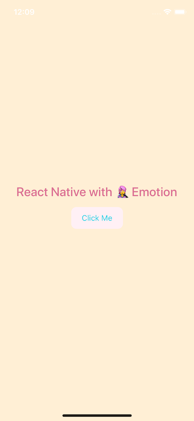
}Emotion-JS utilizes tagged template literals to style your components using back-ticks. When creating a component in React or React Native using this styling library, each component is going to have styles attached to it. Define the below styles in the same file after the App component.
const Container = styled.View`
  flex: 1;
  background-color: papayawhip;
  justify-content: center;
  align-items: center;
`;

const Title = styled.Text`
  font-size: 20px;
  font-weight: 500;
  color: palevioletred;
`;
Notice the Container is a React Native View and has styling attached to it. Similarly, Title is utilizing Text component from React Native. You will get the following result.

Here is the complete code for App.js file.
import React from 'react';
import { StyleSheet, Text, View } from 'react-native';
import styled, { css } from '@emotion/native';
export default class App extends React.Component {
render() {
return (
<Container>
<Title>React Native with 👩🎤 Emotion</Title>
</Container>
);
}
}
const Container = styled.View`
flex: 1;
background-color: papayawhip;
justify-content: center;
align-items: center;
`;
const Title = styled.Text`
font-size: 24px;
font-weight: 500;
color: palevioletred;
`;In the above snippet, do take a note that we are not importing a React Native core components such as View, Text or StyleSheet object. It is that simple. It uses the same flexbox model that React Native Layouts use. The advantage here is that you get to apply almost similar context and understandable syntax that you have been using in Web Development to style a React Native application.
Using Props in Emotion-JS
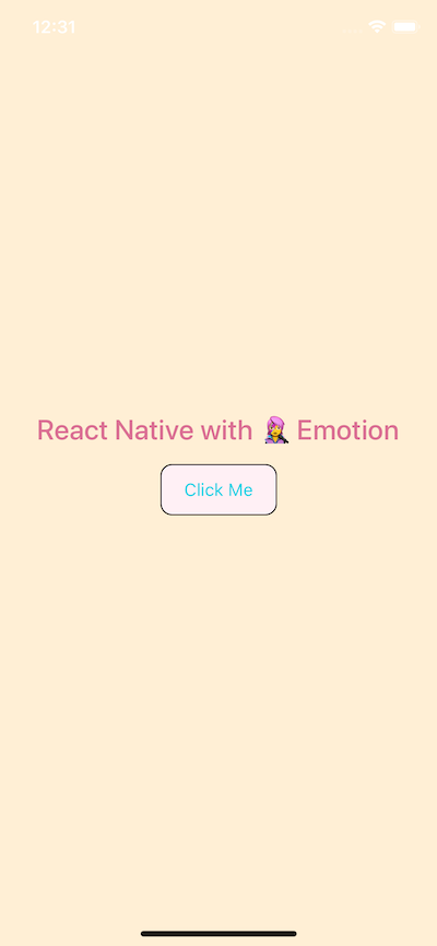
Often you will find yourself creating custom components for your apps. This does give you the advantage to stay DRY. Leveraging emotion-js is no different. You can use this programming pattern by building custom components that require their parent components. props are commonly known as additional properties to a specific component. To demonstrate this, create a new file called CustomButton.js.
Inside this file, we are going to create a custom button that requires props such as backgroundColor, textColor and the text itself for the title of the button. You are going to use TouchableOpacity and Text to create this custom button but without importing react-native library and create a functional component CustomButton.
import React from 'react';
import styled, { css } from '@emotion/native';

const CustomButton = props => (
  <ButtonContainer
    onPress={() => alert('You are using Emotion-JS!')}
    backgroundColor={props.backgroundColor}
  >
    <ButtonText textColor={props.textColor}>{props.text}</ButtonText>
  </ButtonContainer>
);

export default CustomButton;

const ButtonContainer = styled.TouchableOpacity`
  margin: 15px;
    width: 100px;
    height: 40px
    padding: 12px;
    border-radius: 10px;
    background-color: ${props => props.backgroundColor};
`;

const ButtonText = styled.Text`
  font-size: 15px;
  color: ${props => props.textColor};
  text-align: center;
`;
The important thing to notice in the above snippet is you can pass an interpolated function ${props => props...} to an emotion-js template literal to extend it the component's style and keep the component re-usable.
To see this custom button in action, import it to the App.js file as below.
// ... other imports
import CustomButton from './components/CustomButton';
// ...
export default class App extends React.Component {
render() {
return (
<Container>
<Title>React Native with 👩🎤 Emotion</Title>
<CustomButton
text="Click Me"
textColor="#01d1e5"
backgroundColor="lavenderblush"
/>
</Container>
);
}
}On running the simulator, you will get the following result.
Inline Styling
As React Native developer, you have used inline styling and you know how beneficial they can be, especially in the prototypal stage of an application.
To leverage this technique using Emotion-js, open CustomButton.js file and add an inline style like below. Do note that, we are not modifying the existing styles defined previously.
const CustomButton = props => (
    <ButtonContainer
        onPress={() => alert("You are using Emotion-JS!")}
        backgroundColor={props.backgroundColor}
        style={css`
            border-width: 1px;
        `}
    >
        <ButtonText textColor={props.textColor}>{props.text}</ButtonText>
    </ButtonContainer>
The style tag in the above snippet uses css prop from @emotion/native library to allow us to add inline styles.
Building the Grocery UI
Onwards this section, you are going to use what you have just learned about Emotion-js by building a better UI in terms of complexity than a simple test and a button.
Open up App.js. Declare a new ContainerView using styled prop from emotion-js. Inside the backticks, you can put pure CSS code there with the exact same syntax. The View element is like a div in HTML or web programming in general. Also, create another view called Titlebar inside Container.
Inside Titlebar, it will contain three new elements. One is going to be an image Avatar and the other two are text: Title and Name.
import React from 'react';
import styled, { css } from '@emotion/native';
export default class App extends React.Component {
render() {
return (
<Container>
<Titlebar>
<Avatar />
<Title>Welcome back,</Title>
<Name>Aman</Name>
</Titlebar>
</Container>
);
}
}
const Container = styled.View`
flex: 1;
background-color: white;
justify-content: center;
align-items: center;
`;
const Titlebar = styled.View`
width: 100%;
margin-top: 50px;
padding-left: 80px;
`;
const Avatar = styled.Image``;
const Title = styled.Text`
font-size: 20px;
font-weight: 500;
color: #b8bece;
`;
const Name = styled.Text`
font-size: 20px;
color: #333333;
font-weight: bold;
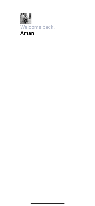
`;You will get the following result in the simulator.
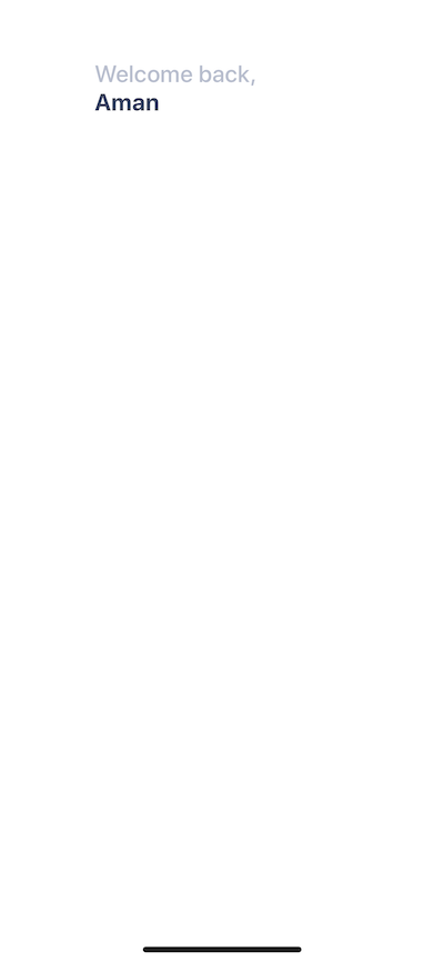
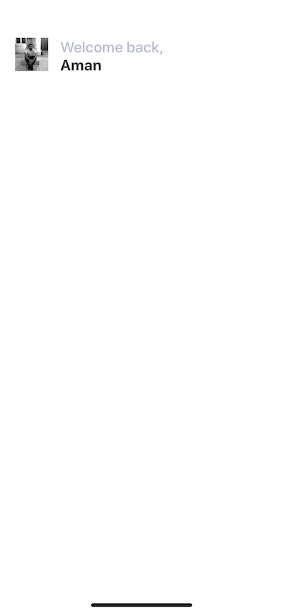
Right now, everything is how in the middle of the screen. We need the Titlebar and its contents at the top of the mobile screen. So styles for Container can be modified as below.
const Container = styled.View`
  flex: 1;
  background-color: white;
`;
You will get the following result.
Adding the user avatar image
I am going to use an image that is stored in the assets folder in the root of our project. If are free to use your own image but you can also download the assets for this project below.
To create an image even with emotion-js, you need the Image component from React Native core. You can use the source props to reference the image based on where it is located.
<Titlebar>
  <Avatar source={require('./assets/avatar.jpg')} />
  <Title>Welcome back,</Title>
  <Name>Aman</Name>
</Titlebar>
The styling for Avatar will begin with a width and a height each of 44 pixels.
const Avatar = styled.Image`
  width: 44px;
  height: 44px;
`;
You will get the following result.
Absolute Positioning in React Native
Now notice that the avatar image and the text are piling up. They are taking the same space on the screen. To avoid this, you are going to use position: absolute CSS property.
CSS properties such as padding and margin are used to add space between UI elements in relation to one another. This is the default layout position. However, you are currently in a scenario where it will be beneficial to use absolute positioning of UI elements and place the desired UI element at the exact position you want.
In React Native and CSS in general, if position property is set to absolute, then the element is laid out relative to its parent. CSS has other values for position but React Native only supports absolute.
Modify Avatar styles as below.
const Avatar = styled.Image`
  width: 44px;
  height: 44px;
  margin-left: 20px;
  position: absolute;
  top: 0;
  left: 0;
`;
Usually, with position absolute property, you are going to use a combination of the following properties:
- top
- left
- right
- bottom
In the case above, we use top and left and both are set to 0 pixels. You will get the following output.
Mapping through a list of categories
Inside components/ folder create a new file called Categories.js. This file is going to render a list of category items for the Grocery UI app.
import React from 'react';
import styled, { css } from '@emotion/native';
const Categories = props => (
<Container>
<Name>Fruits</Name>
<Name>Bread</Name>
<Name>Drinks</Name>
<Name>Veggies</Name>
</Container>
);
export default Categories;
const Container = styled.View``;
const Name = styled.Text`
font-size: 28px;
font-weight: 600;
margin-left: 15px;
color: #bcbece;
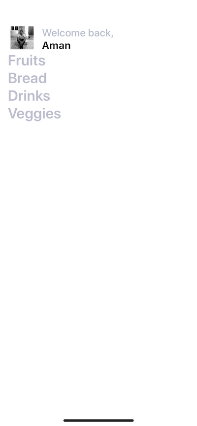
`;All the data is static right now. Import this component in App.js and place it after Titlebar.
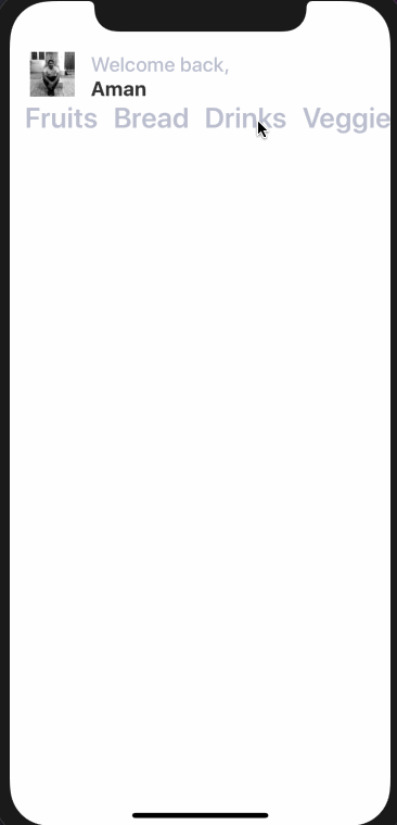
<Container>
  <Titlebar>
    <Avatar source={require('./assets/avatar.jpg')} />
    <Title>Welcome back,</Title>
    <Name>Aman</Name>
  </Titlebar>
  <Categories />
</Container>
You will get the following result.
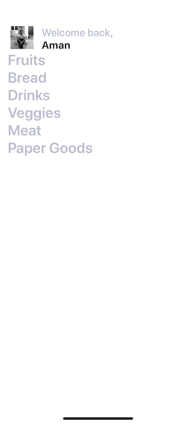
There can be a number of categories. To make the names of categories dynamic, we can send it through App.js file.
const items = [
  { text: 'Fruits' },
  { text: 'Bread' },
  { text: 'Drinks' },
  { text: 'Veggies' },
  { text: 'Meat' },
  { text: 'Paper Goods' }
];

// ...

// Inside the render function replace <Categories /> with

{
  items.map((category, index) => (
    <Categories name={category.text} key={index} />
  ));
}
In the above snippet, you are using map function from JavaScript to iterate through an array render a list of items, in this category names. Adding a key prop is required. To make this work, also modify Categories.js.
import React from 'react';
import styled, { css } from '@emotion/native';

const Categories = props => <Name>{props.name}</Name>;

export default Categories;

const Name = styled.Text`
  font-size: 28px;
  font-weight: 600;
  margin-left: 15px;
  color: #bcbece;
`;
There is no change in the UI.
Adding Horizontal ScrollView
This list is right now not scrollable. To make it scrollable, let us place it inside a ScrollView. Open up App.js file place the categories inside a ScrollView, but first, import it from React Native core.
import { ScrollView } from 'react-native';

//...
<ScrollView>
  {items.map((category, index) => (
    <Categories name={category.text} key={index} />
  ))}
</ScrollView>;
You will notice not a single change in the UI. By default, scrollable lists in React Native using ScrollView are vertical. Make this horizontal by adding the prop horizontal.
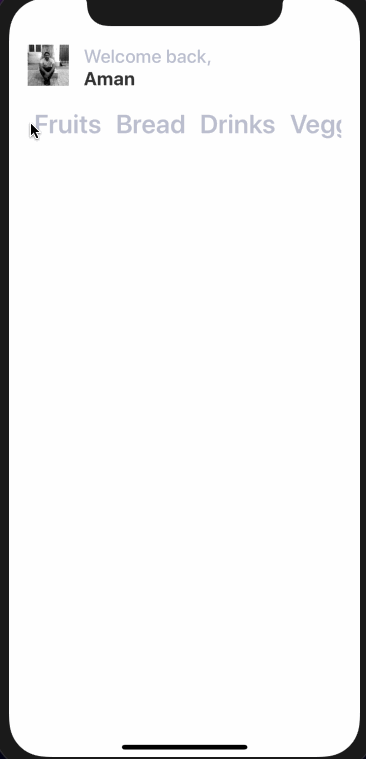
<ScrollView horizontal={true} showsHorizontalScrollIndicator={false}>
  {items.map((category, index) => (
    <Categories name={category.text} key={index} />
  ))}
</ScrollView>
It works.
To make it appear better, add some inline styling using css prop.
<ScrollView
    horizontal={true}
    showsHorizontalScrollIndicator={false}
    style={css`
    margin: 20px;
    margin-left: 12px;
    `}
>
Now it looks better.
Adding a vertical ScrollView
Next step is to add a ScrollView that acts as a wrapper inside the Container view such that the whole area becomes scrollable vertically. There is a reason to do this. You are now going to add items separated into two columns as images with texts related to a particular category.
Modify App.js file.
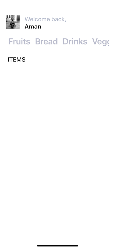
return (
  <Container>
    <ScrollView>
      <Titlebar>{/* and its contents */}</Titlebar>
      <ScrollView horizontal={true}>
        {/* Categories being rendered */}
      </ScrollView>
      <Subtitle>Items</Subtitle>
    </ScrollView>
  </Container>
);
Notice that we are adding another emotion component called Subtitle which is nothing but a text.
It renders like below.
Building a card component
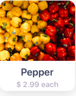
In this section, we are going to create a card component that will hold an item’s image, the name of the item and the price as text. Each card component is going to have curved borders and box shadow. This is how it is going to look like.
Create a new component file called Card.js inside the components directory. The structure of the Card component is going to be.
import React from 'react';
import styled, { css } from '@emotion/native';

const Card = props => (
  <Container>
    <Cover>
      <Image source={require('../assets/pepper.jpg')} />
    </Cover>
    <Content>
      <Title>Pepper</Title>
      <PriceCaption>$ 2.99 each</PriceCaption>
    </Content>
  </Container>
);

export default Card;
Currently, it has static data, such as the image, title, and content. Let us add the styles for each styled UI elements in this file.
const Container = styled.View`
  background: #fff;
  height: 200px;
  width: 150px;
  border-radius: 14px;
  margin: 18px;
  margin-top: 20px;
  box-shadow: 0 5px 15px rgba(0, 0, 0, 0.15);
`;

const Cover = styled.View`
  width: 100%;
  height: 120px;
  border-top-left-radius: 14px;
  border-top-right-radius: 14px;
  overflow: hidden;
`;

const Image = styled.Image`
  width: 100%;
  height: 100%;
`;

const Content = styled.View`
  padding-top: 10px;
  flex-direction: column;
  align-items: center;
  height: 60px;
`;

const Title = styled.Text`
  color: #3c4560;
  font-size: 20px;
  font-weight: 600;
`;

const PriceCaption = styled.Text`
  color: #b8b3c3;
  font-size: 15px;
  font-weight: 600;
  margin-top: 4px;
`;
The Container view has a default background of white color. This is useful in scenarios where you are fetching images from a third party APIs. Also, it provides a background to the text area below the image.
Inside the Container view, add an Image and wrap it inside a Cover view. In React Native there two ways you can fetch an image.
If you are getting an image from the static resource as in our case, you use source prop with the keyword require that contains the relative path to the image asset stored in the project folder. In case of networking images or getting an image from an API, you use the same prop with a different keyword called uri. Here is an example of an image being fetched from an API.
<Image
  source={{
    uri: 'https://facebook.github.io/react-native/docs/assets/favicon.png'
  }}
/>
The Cover view uses rounded corners with overflow property. This is done to reflect the rounded corners. iOS clips the images if coming from a child component. In our case, the image is coming from a Card component which is a child to the App component.
The Image component takes the width and height of the entire Cover view.
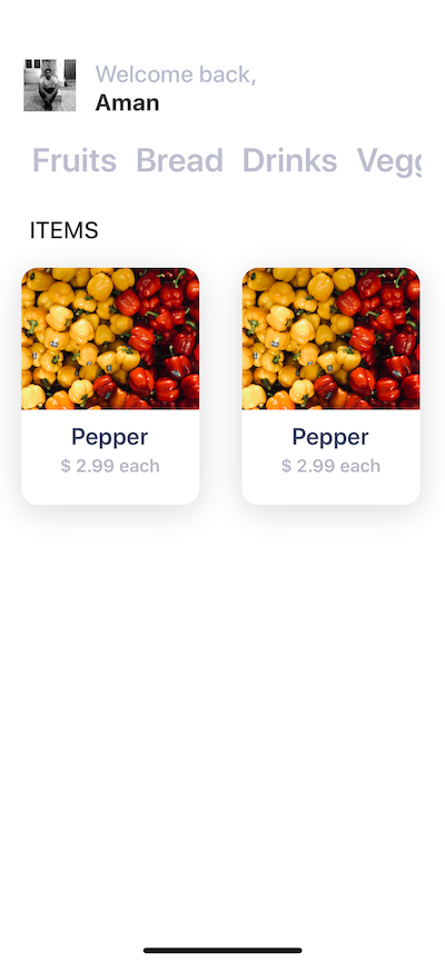
Now let us import this component inside App.js file, after the Subtitle and let us see what results do we get.
render() {
    return (
    <Container>
        <ScrollView>
        {/* ... */}
        <Subtitle>Items</Subtitle>
            <ItemsLayout>
                <ColumnOne>
                    <Card />
                </ColumnOne>
                <ColumnTwo>
                    <Card />
                </ColumnTwo>
            </ItemsLayout>
        </ScrollView>
    </Container>
    )
}

// ...

const ItemsLayout = styled.View`
    flex-direction: row;
    flex: 1;
`;

const ColumnOne = styled.View``;

const ColumnTwo = styled.View``;
After Subtitle adds a new view called ItemsLayout. This is going to be a layout that allows different cards to be divided between two columns in each row. This can be done by giving this view a flex-direction property of value row. ColumnOne and ColumnTwo are two empty views.
On rendering the final result, it looks like below.
Conclusion
You have completed the tutorial for creating UIs with Emotion-JS and integrate it into a React Native and Expo application. Now go ahead and create those beautiful UIs for your applications.